SUPERFEET
A head to toe makeover.
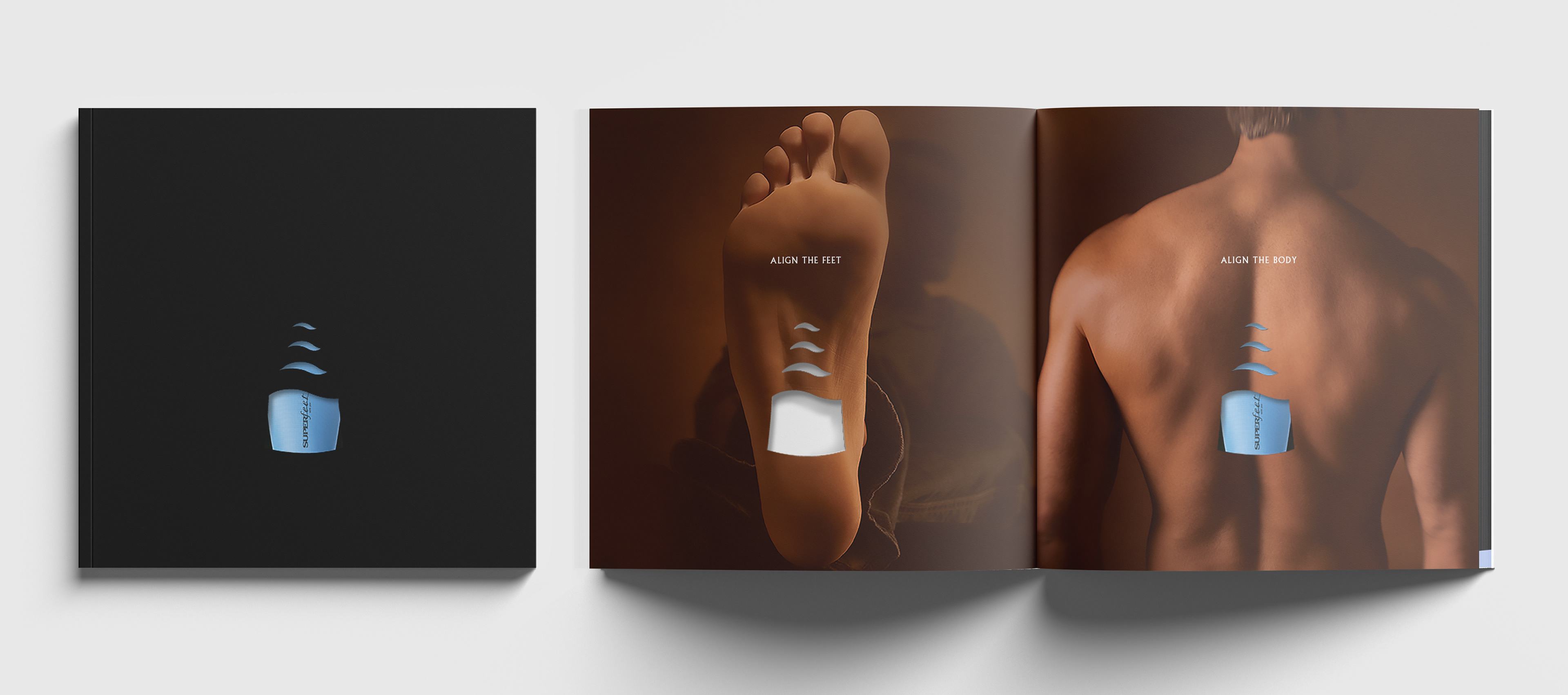
If you think of insoles at all, (it’s okay, most people don’t) premium is not usually a word that comes to mind. But it should be. As it turns out, good foot health equals good body health. Not to mention all the benefits of having your “feet feel super.”
Superfeet are go-tos for anyone with foot issues like pronation, supination or plantar problems. They had become extremely popular among skiers initially, then expanded to pretty much every activity with specialized footwear from Mountain Biking to Hockey. And for every activity, they made a new package with a stock photo of someone performing that sport. Same product, different package for each type of store. Things got confusing really quickly.
We overhauled the entire product categorization system to reflect the premium quality and healthy advantages of Superfeet. New packaging, design system, trade show materials and advertising messaging were all given the update.
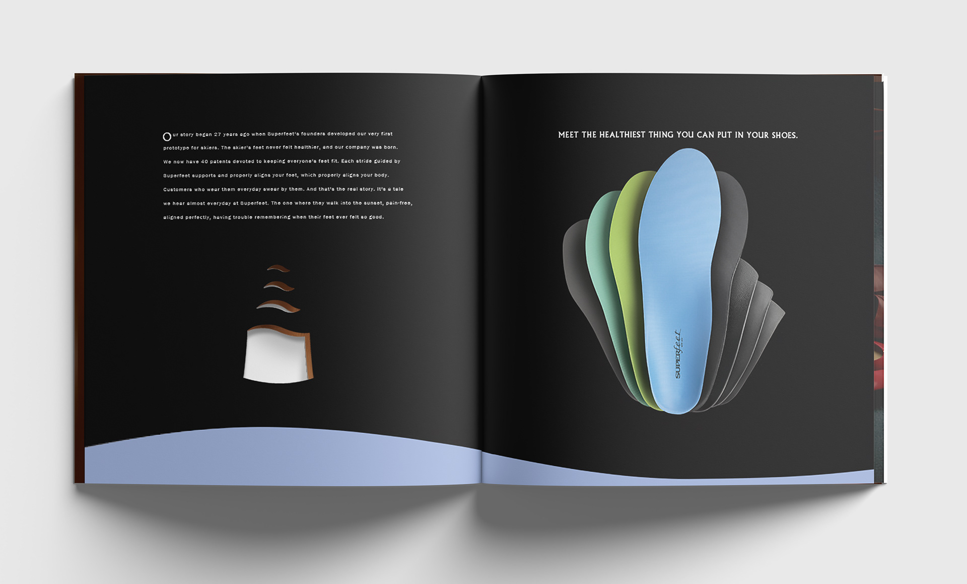
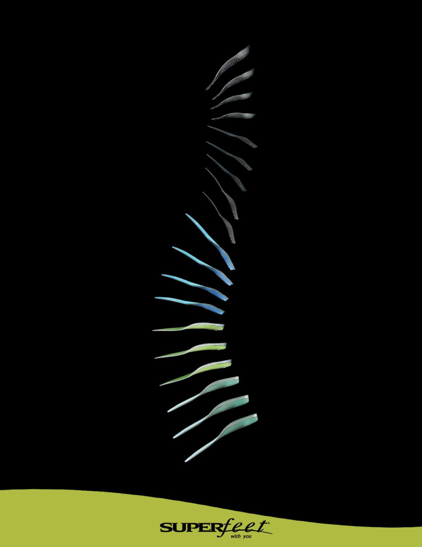
Superfeet already differentiated the actual product by color to represent levels of support. So the decision was easy to move on from their countless activity-based iterations and make the package reflect the same information the footbed color did.
I wore some, and carried a half dozen footbeds around with me for weeks. I even kept one on the dash of my car. Realizing the insole itself is slightly curved, a bit like a normal arch of a back, I let that connection inspire the package design exploration. Making hundreds of paper models, I developed a curved box configuration that would hold together. I ran it by package manufacturing engineers and with a few tweaks, they created a dieline for us.
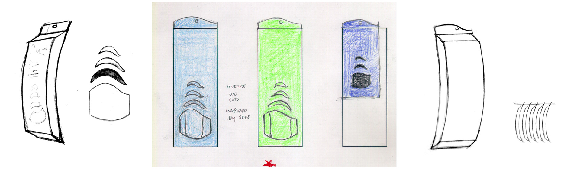
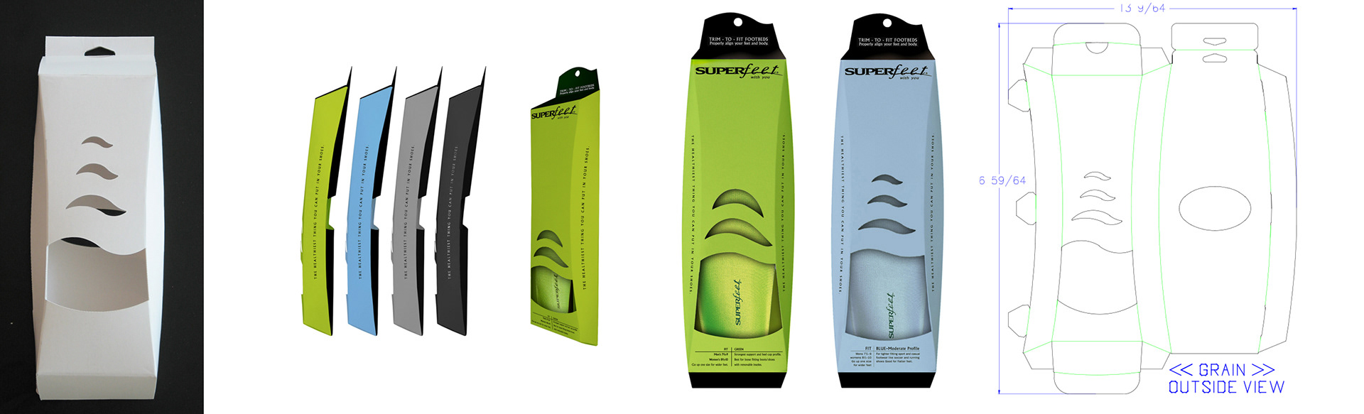
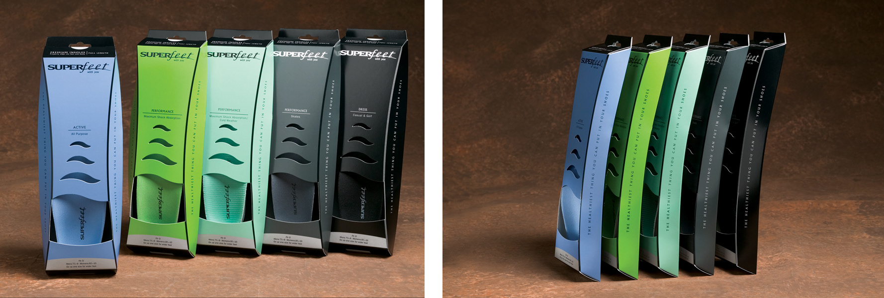
The finished result was a bespoke box shape and a color-coded design system. The effect in-store, especially at larger retailers like REI, was giant blocks of color spanning across a peg wall that cut straight through the clutter of insoles with pictures of hikers and skiers on them.
...And we were off and running with consumer brochures, trade show materials, you name it. Here's just a taste.
This brochure featured two die cuts stacked on top of each other creating a hole through to the product shot, mimicking the open front of the packaging.
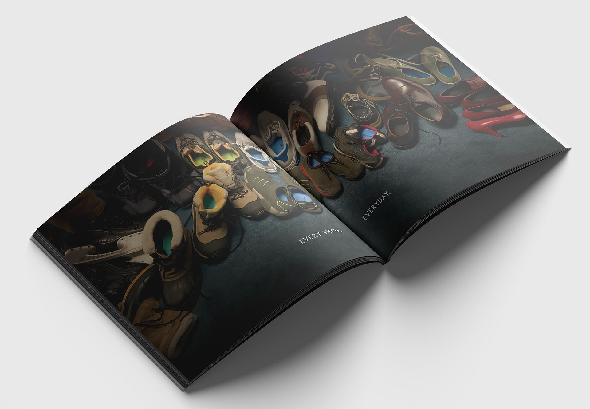
The shot above was inspired by the tripping-fest that was the floor of my home closet. It got a lot of mileage as we cropped in on different sections for in-store signage at specialty retailers.
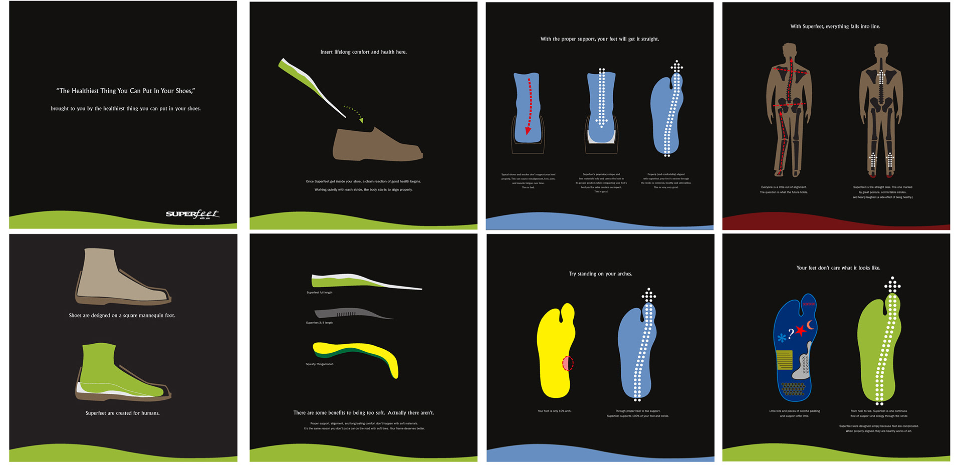
When we started working with them, the top Superfeet salesman came to our office to explain how the footbeds worked. It was a foreign concept to us that firm under your feet was better than super spongy. He was able to tell us why firmer was better, one step at a time. And suddenly it clicked and all made perfect sense. His presentation was a rag-tag folder he had curated over years with any piece of paper that helped him tell the story. Some he had even made himself. It was rough, but effective.
Once the brand look and tone were set, we took it upon ourselves to create (see above) a cohesive set of "education visuals" based on his folder and to replace stacks of papers being used as presentation guides with potential retailers. That top guy though, he kept using his rag tag folder. Which you just have to respect. The guy was good at his gig.
With OR being their biggest trade show of the year, we went to work on a suite of posters for every wall and corner of their massive, custom made booth. Here's a few...
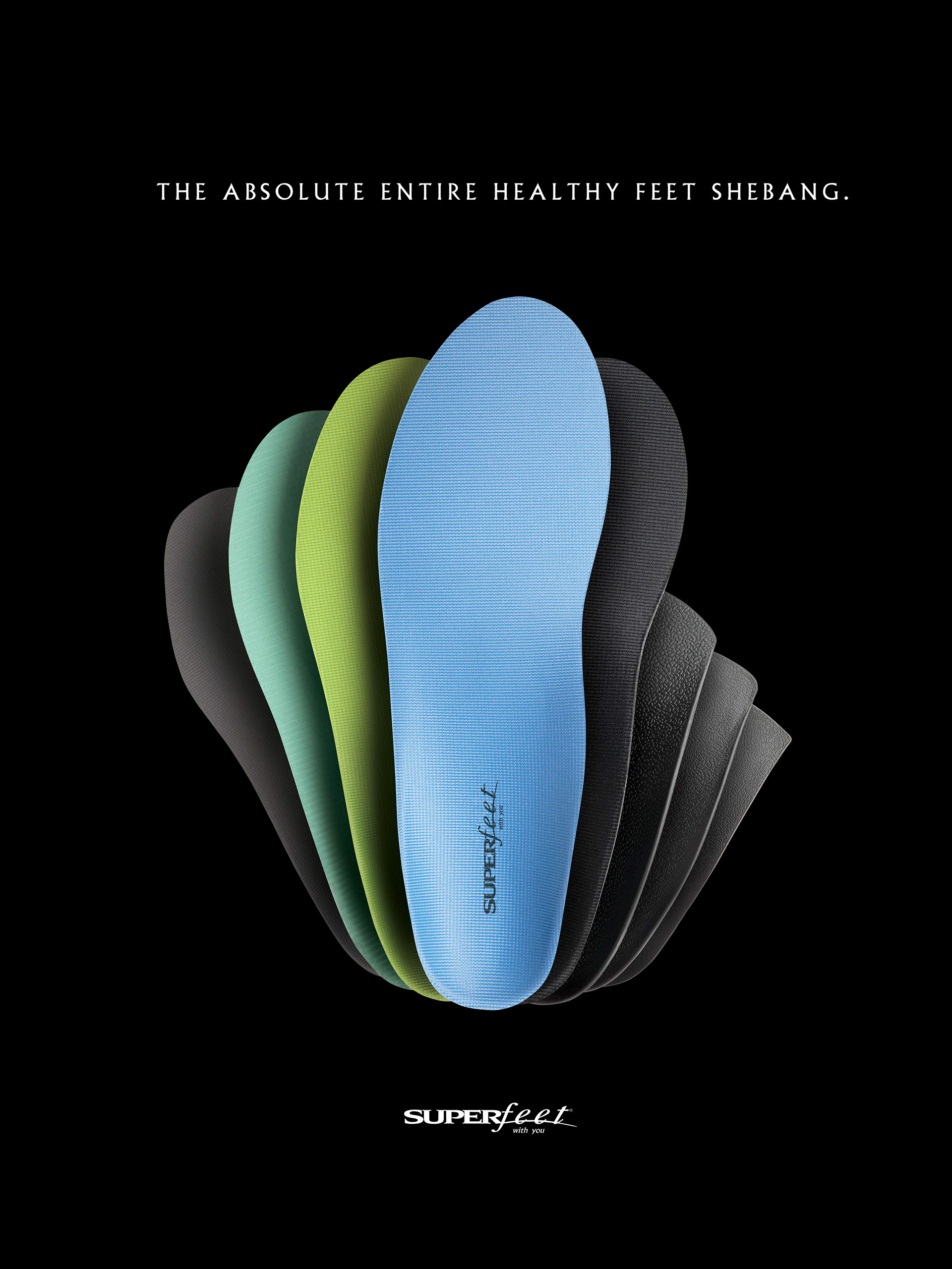
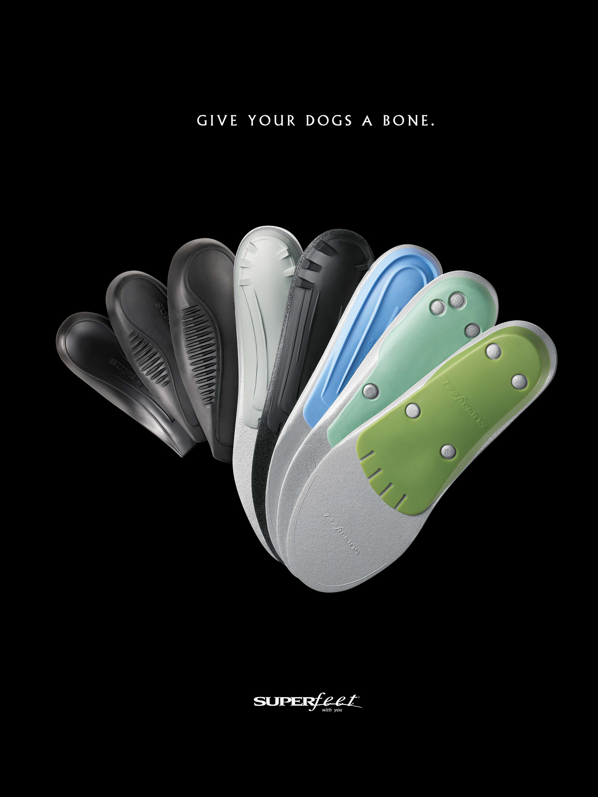
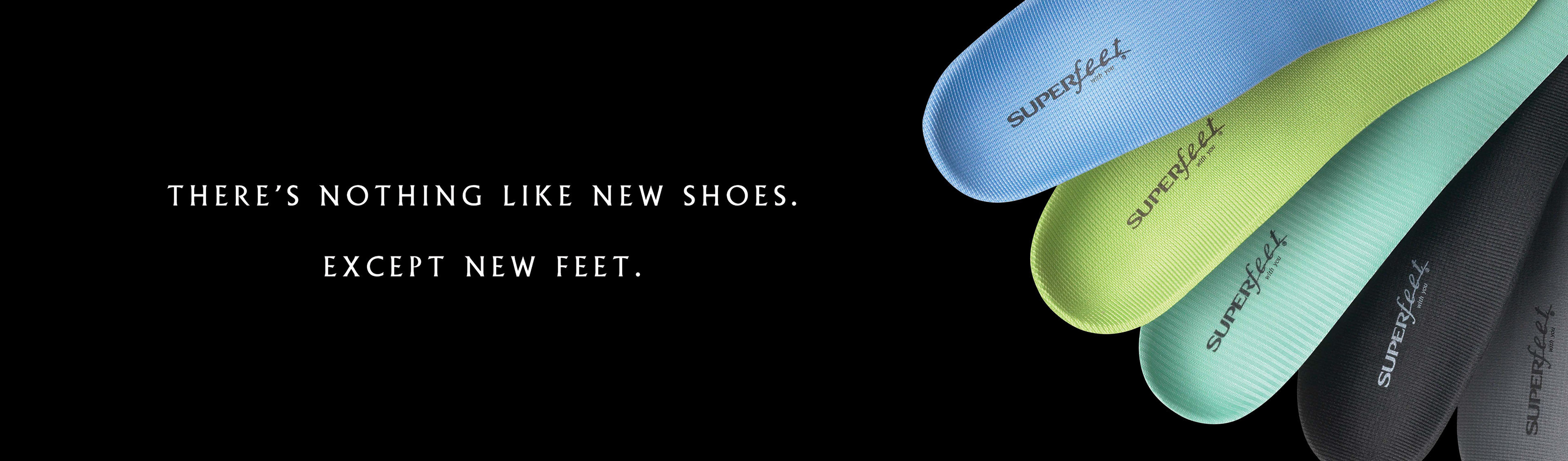
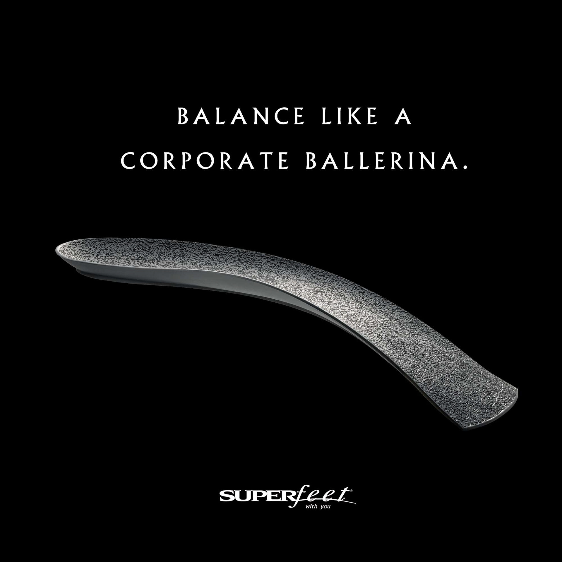
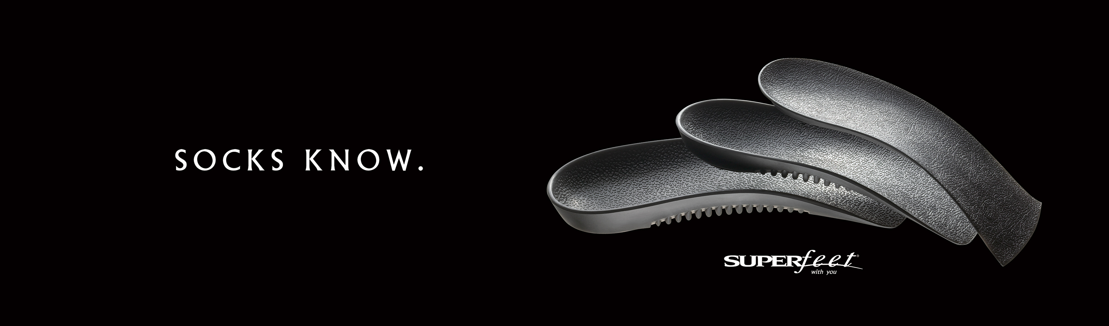
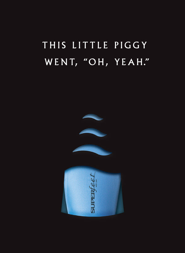
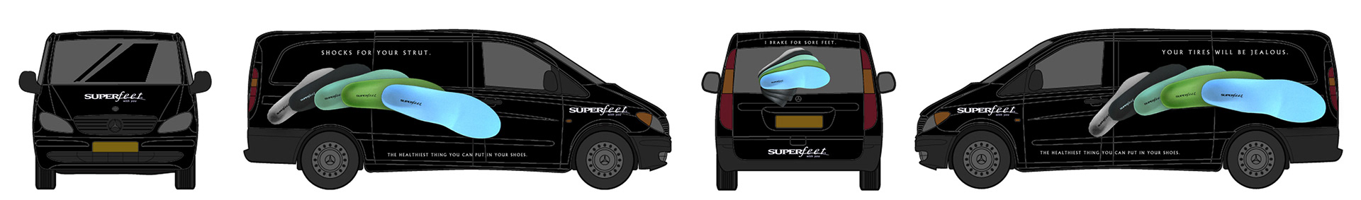
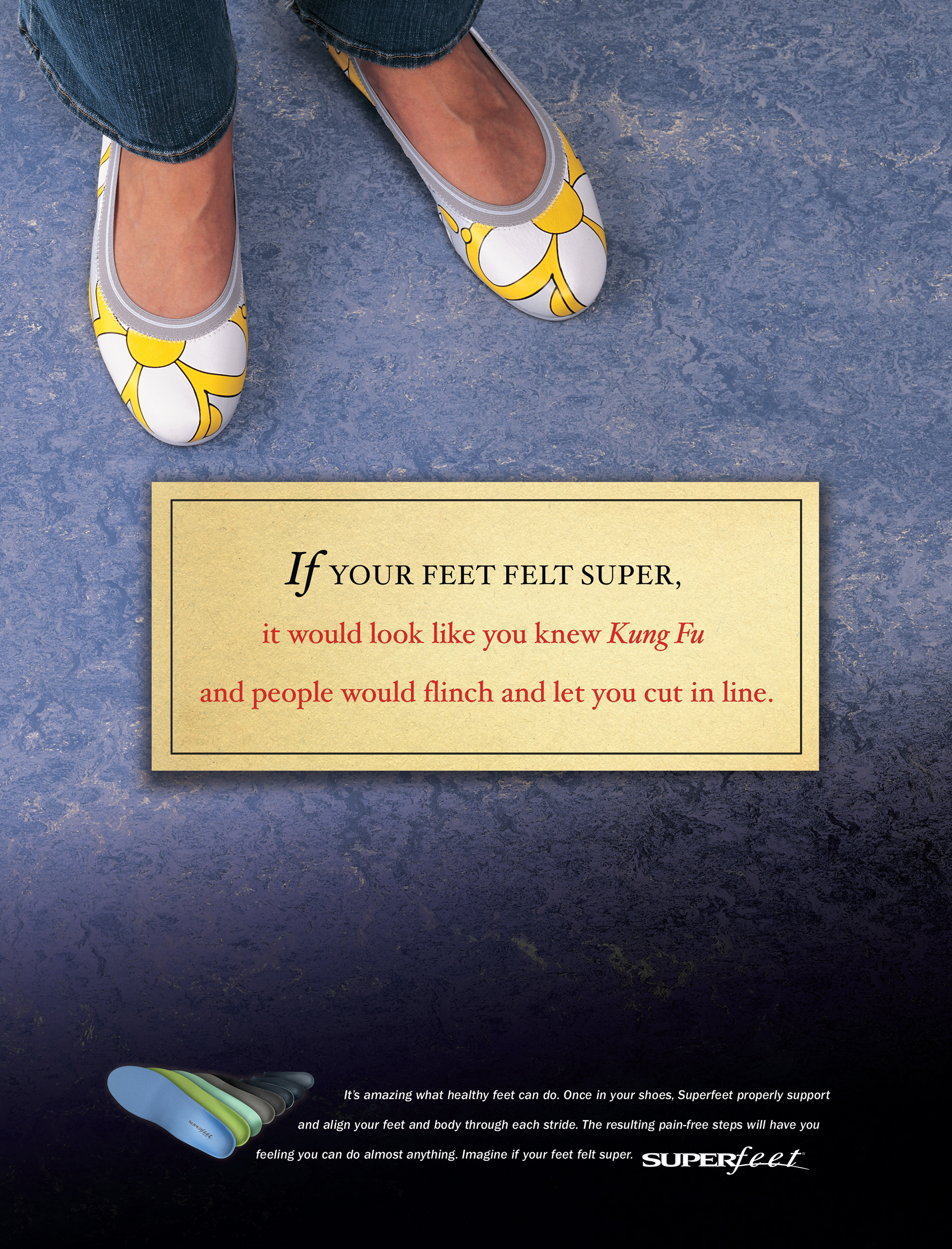
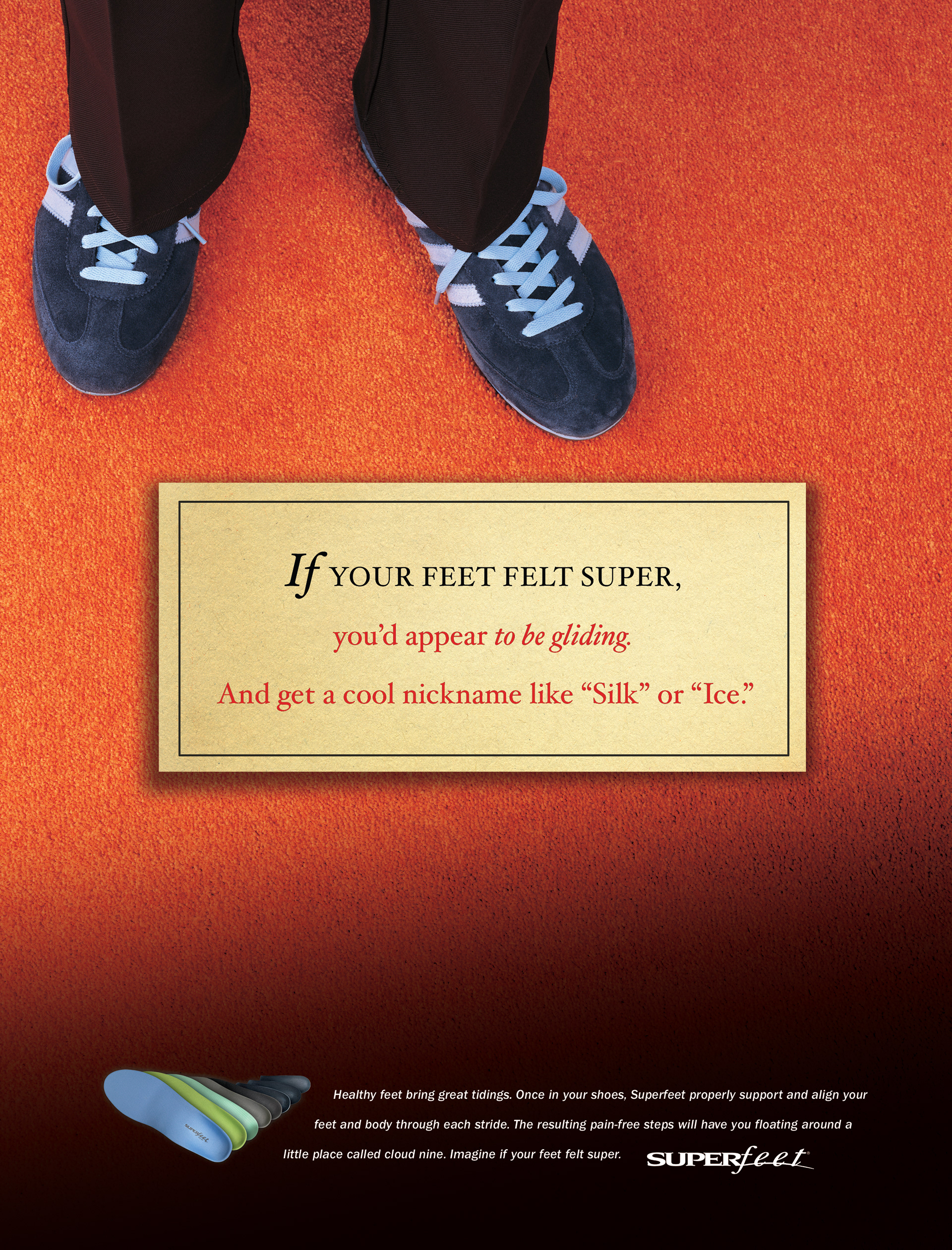
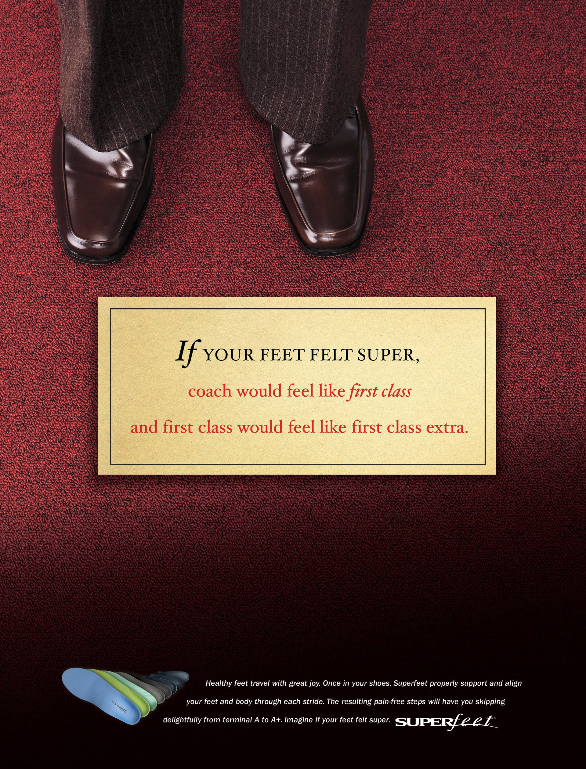
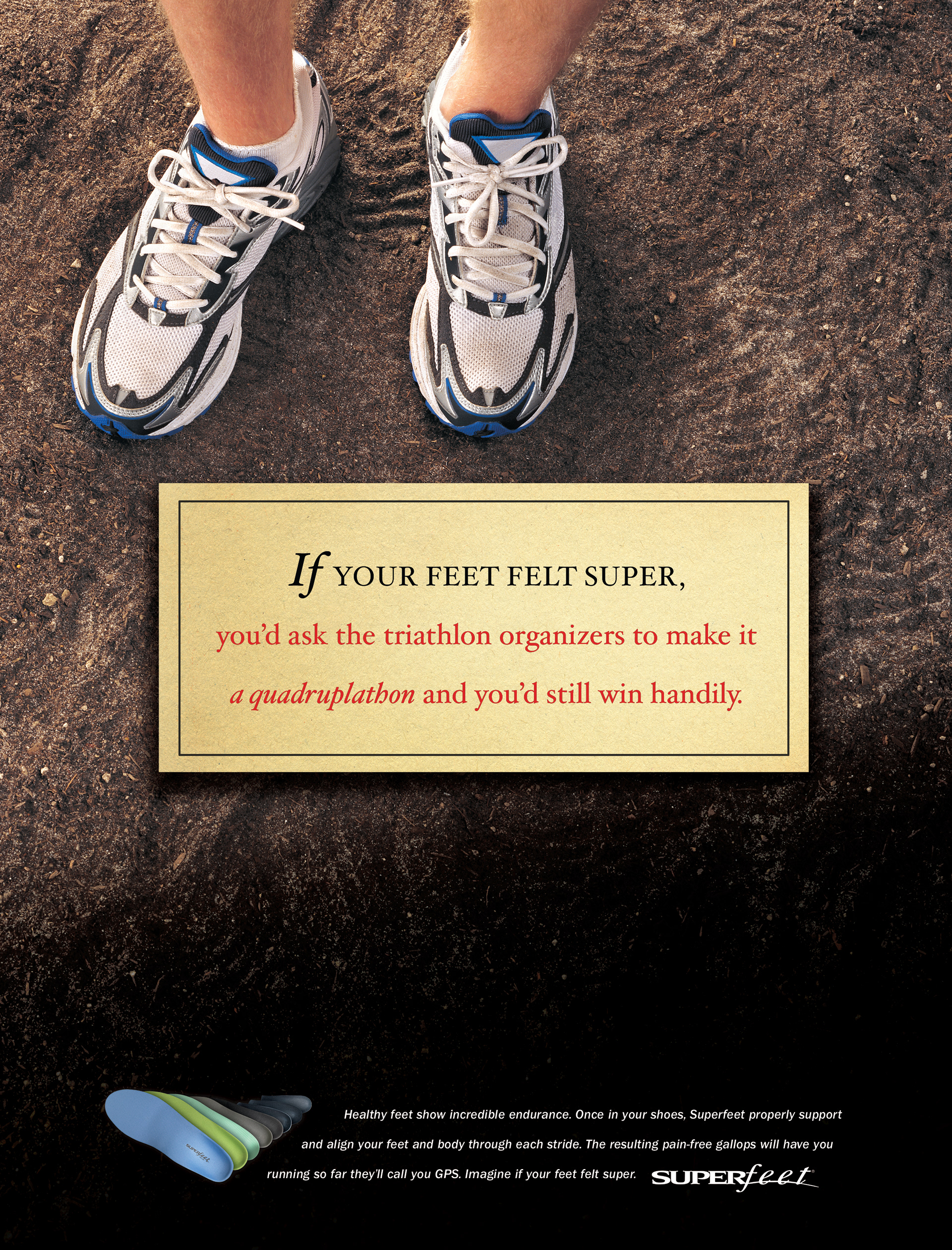
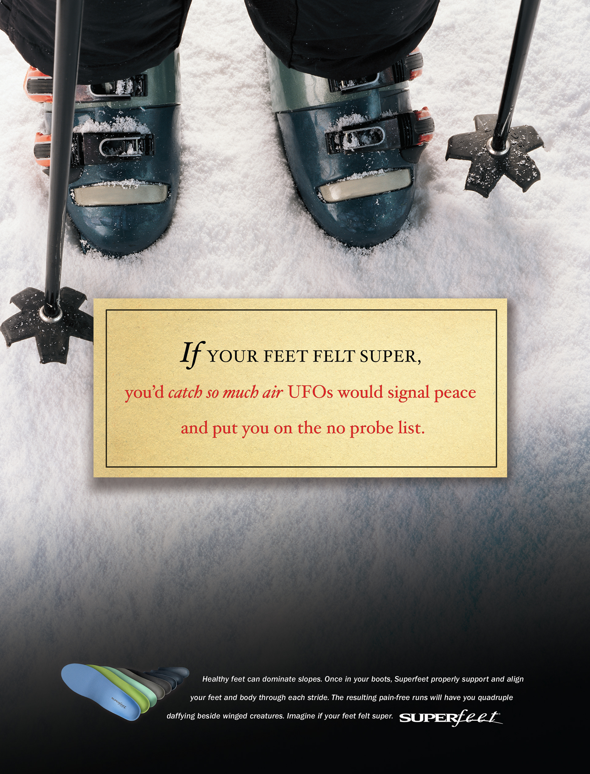
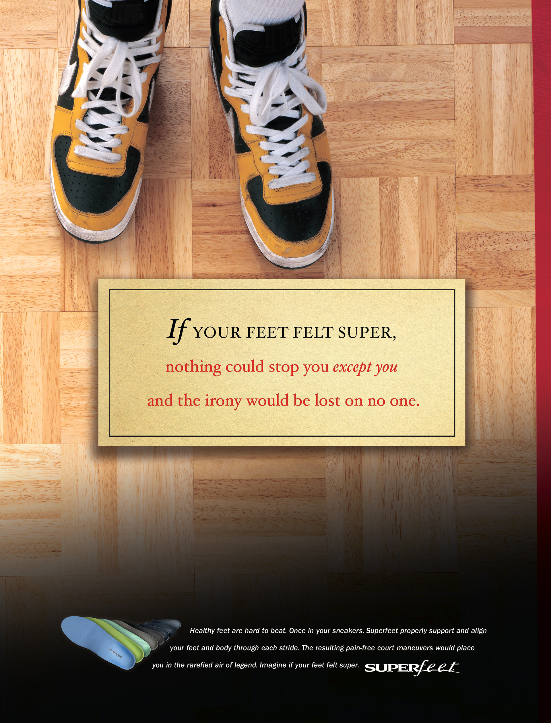
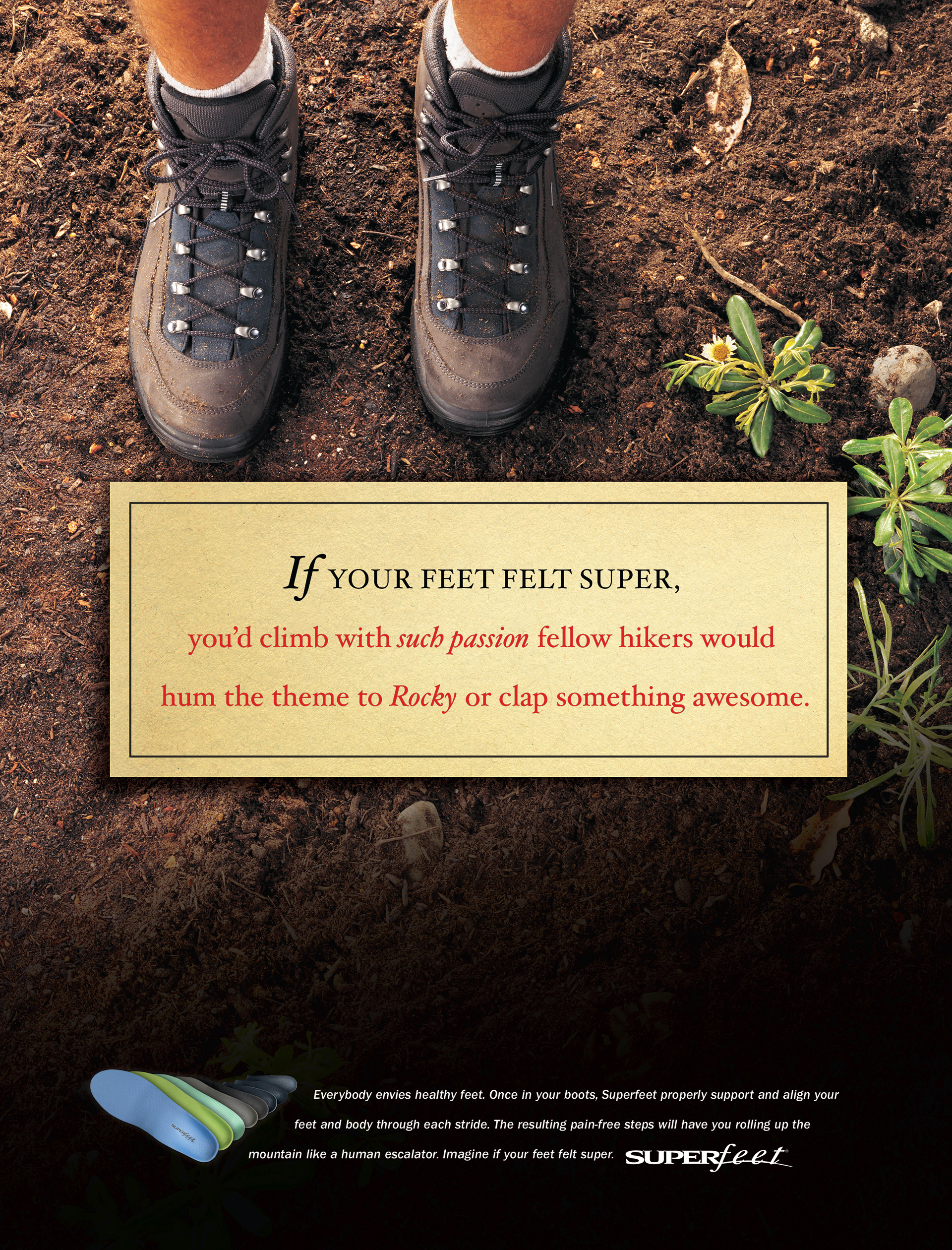
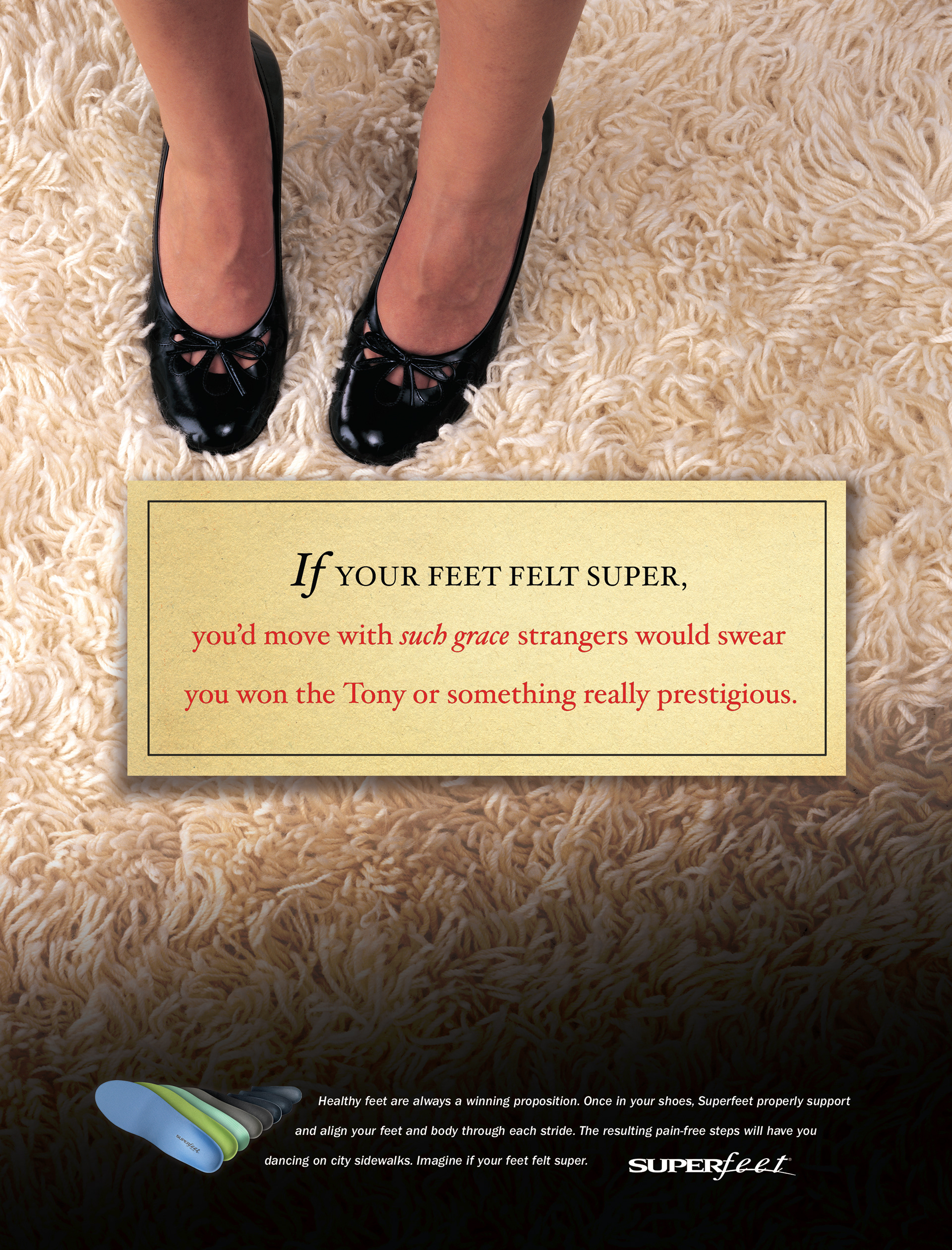
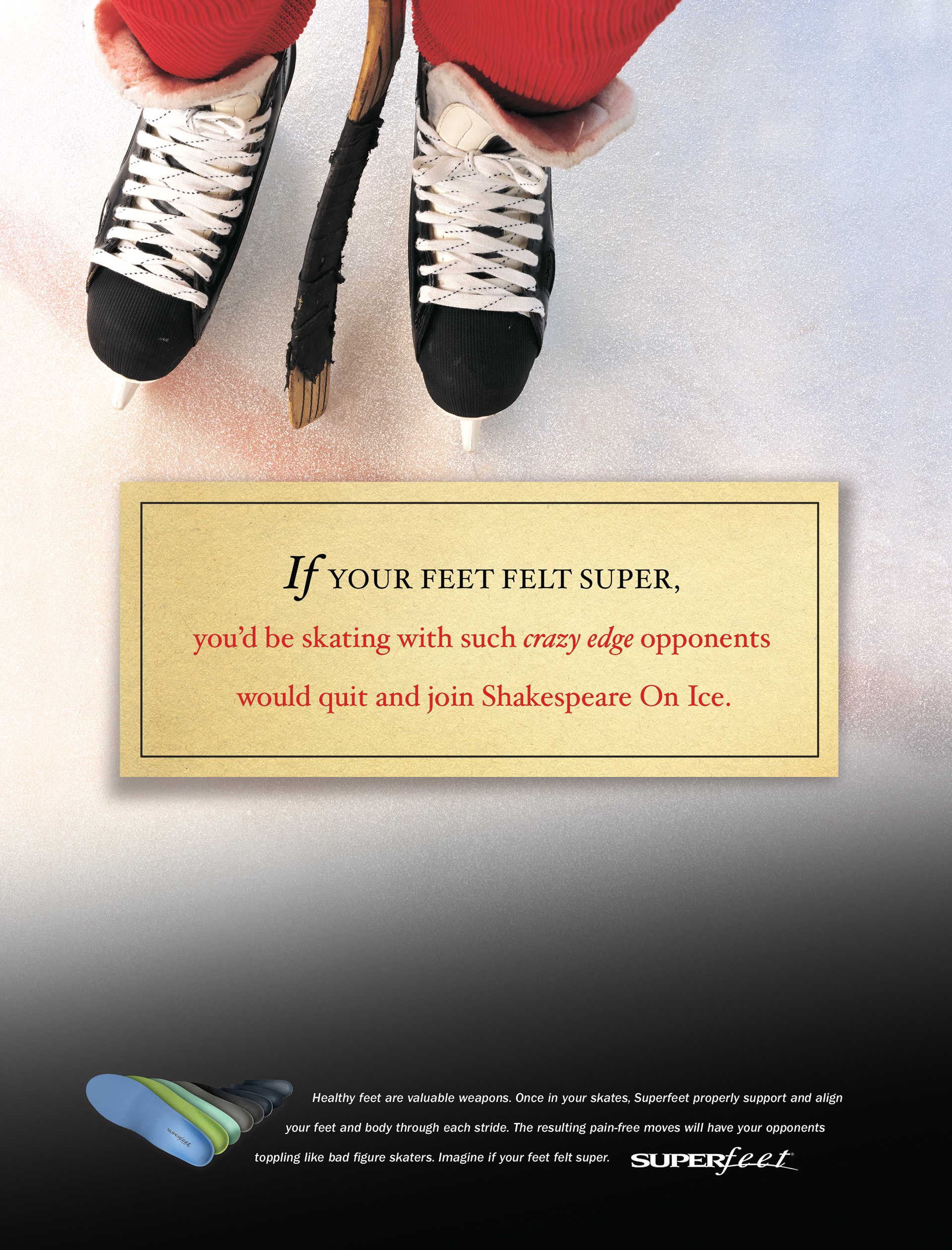
And then of course, we did an ad campaign covering off their major activity-based and general-use markets.
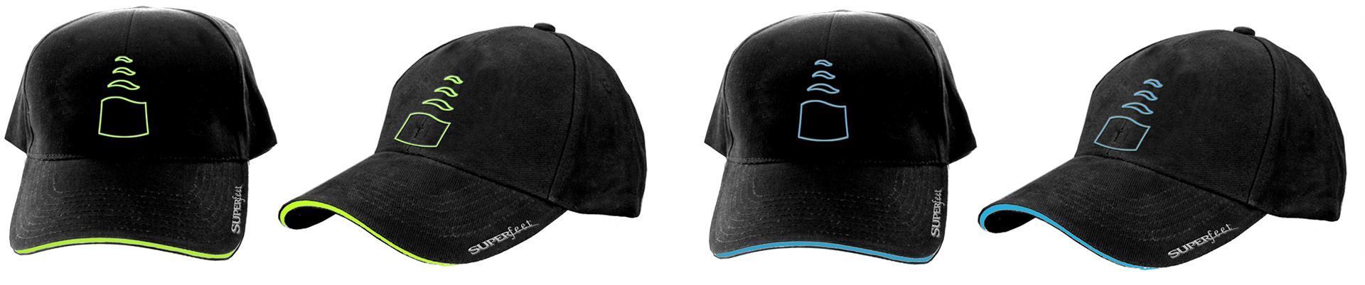
Believe it or not, there is even more work than this. In-store display racks and try-on chairs... you get the idea. We re-did EVERYTHING they or we could think of.